Plot ROC curve and barplot of AUC values for each method for a specific comparion or for all comparisons
Source:R/SpikeDEPlots.R
plot_ROC_AUC_spiked.RdPlot ROC curve and barplot of AUC values for each method for a specific comparion or for all comparisons
Arguments
- se
SummarizedExperiment containing all necessary information of the proteomics data set
- de_res
data table resulting of run_DE
- ain
Vector of strings of normalization methods to visualize (must be valid normalization methods saved in stats)
- comparisons
Vector of comparisons (must be valid comparisons saved in stats)
Examples
data(spike_in_se)
data(spike_in_de_res)
plot_ROC_AUC_spiked(spike_in_se, spike_in_de_res)
#> All comparisons of de_res will be visualized.
#> All normalization methods of de_res will be visualized.
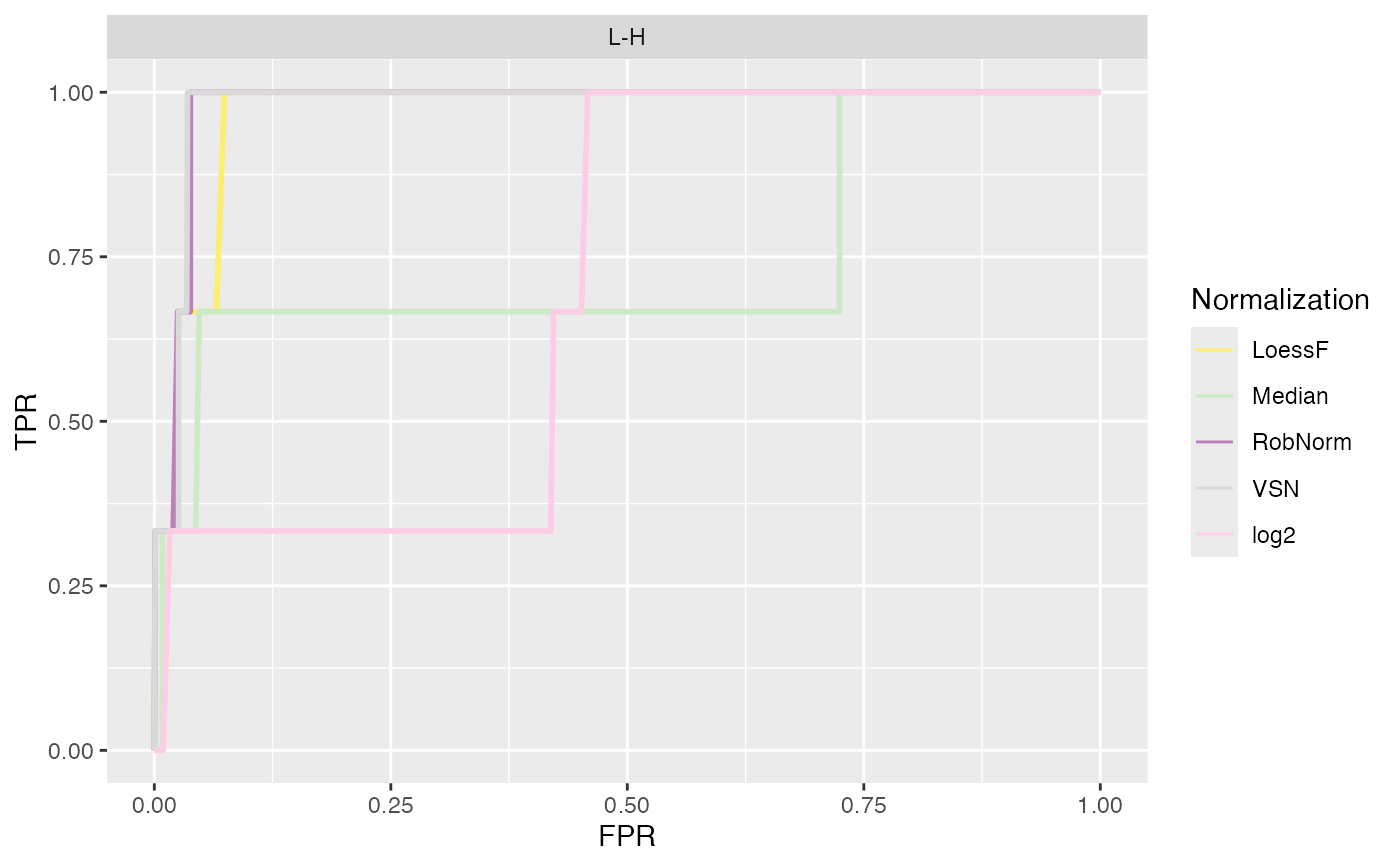
#> $ROC
 #>
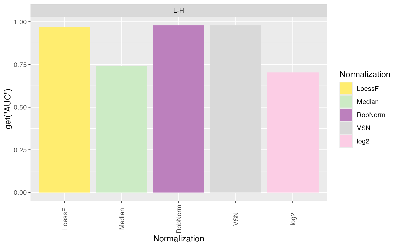
#> $AUC_bars
#>
#> $AUC_bars
 #>
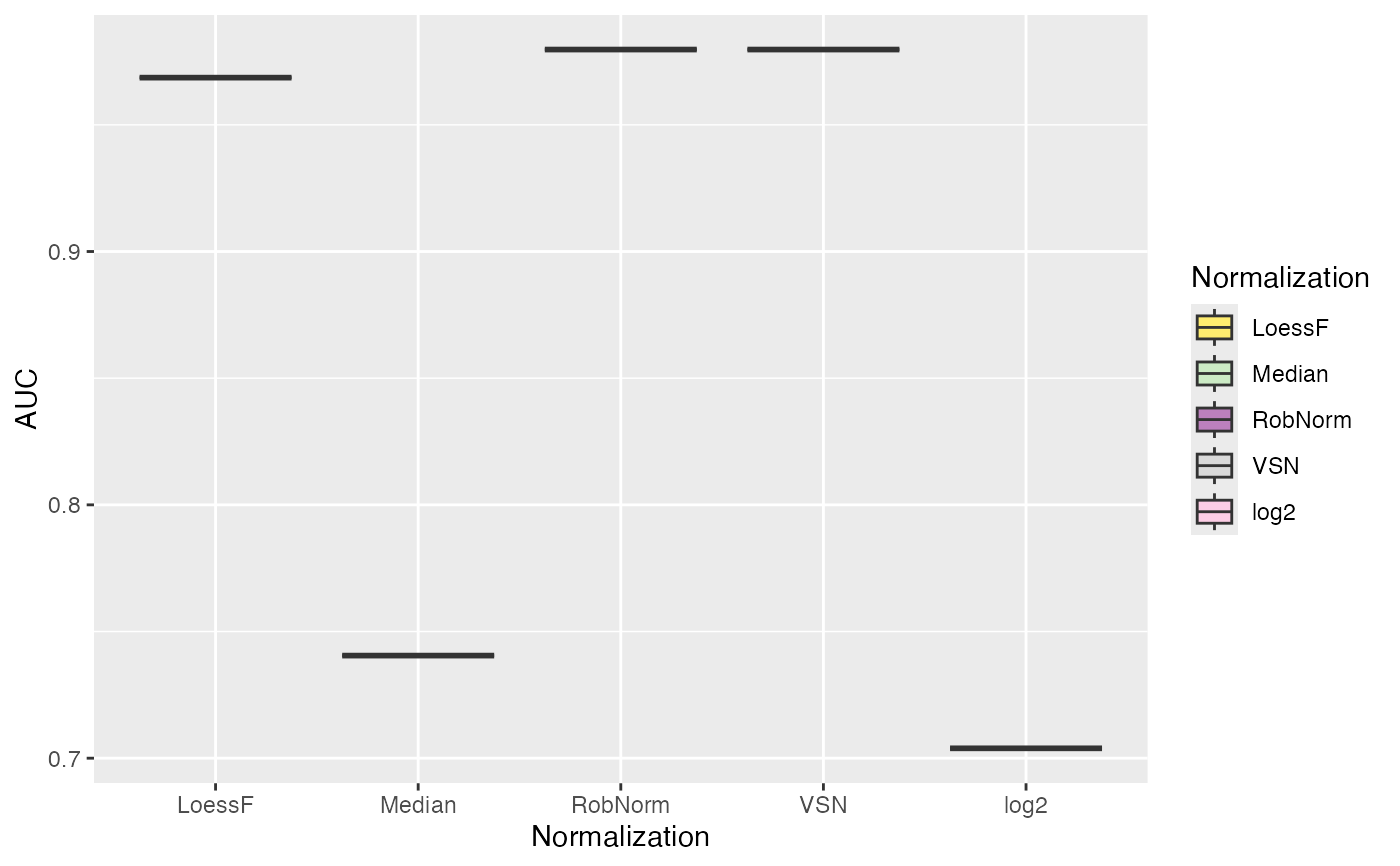
#> $AUC_box
#>
#> $AUC_box
 #>
#> $AUC_dt
#> PANEL Comparison group Assay AUC
#> 1 1 L-H 1 LoessF 0.9686312
#> 2 1 L-H 2 Median 0.7404943
#> 3 1 L-H 3 RobNorm 0.9797212
#> 4 1 L-H 4 VSN 0.9797212
#> 5 1 L-H 5 log2 0.7038973
#>
#>
#> $AUC_dt
#> PANEL Comparison group Assay AUC
#> 1 1 L-H 1 LoessF 0.9686312
#> 2 1 L-H 2 Median 0.7404943
#> 3 1 L-H 3 RobNorm 0.9797212
#> 4 1 L-H 4 VSN 0.9797212
#> 5 1 L-H 5 log2 0.7038973
#>